2025
Branding
Four

Four is a natural, healthy and dietetic brand of dried fruits, cooking aids and snacks.
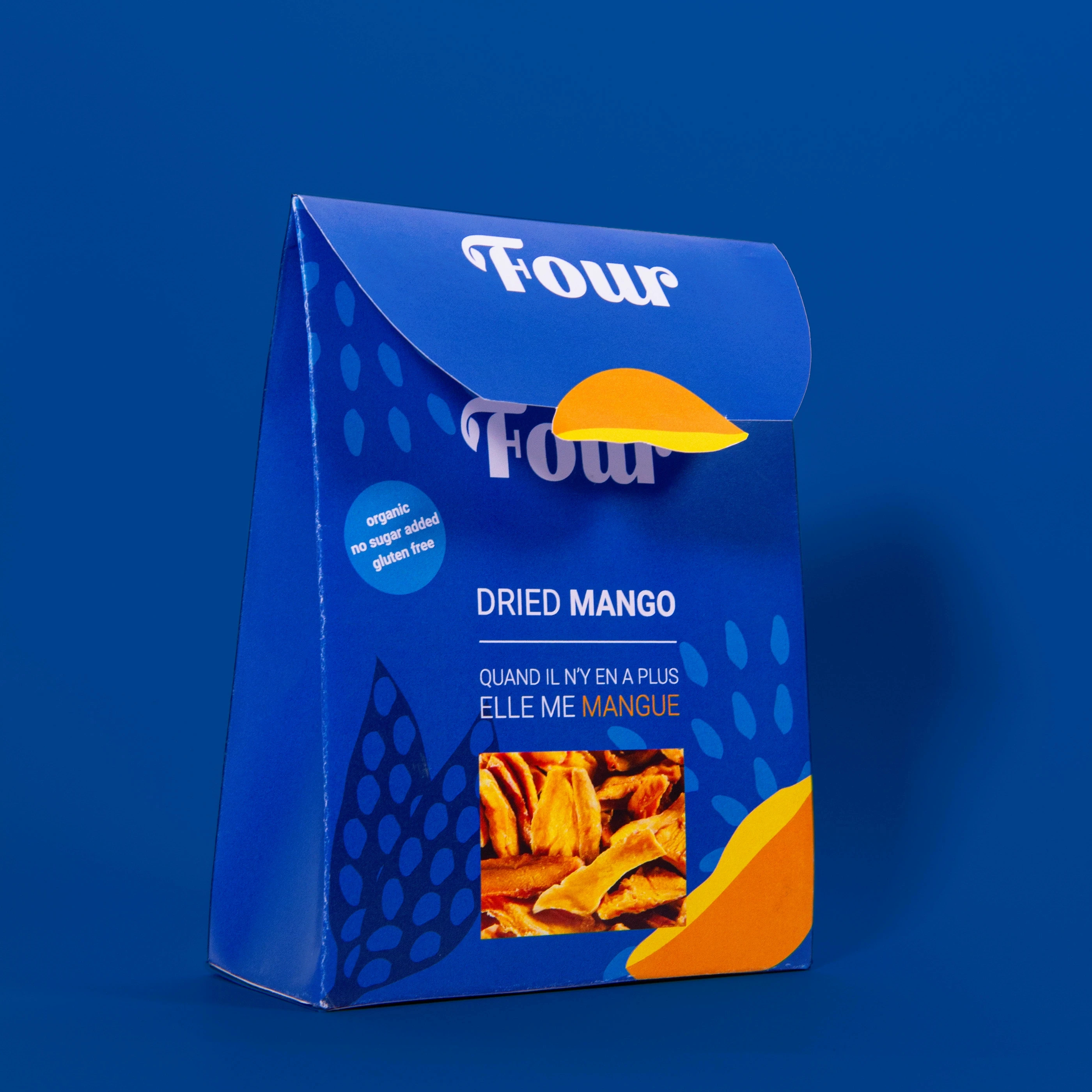
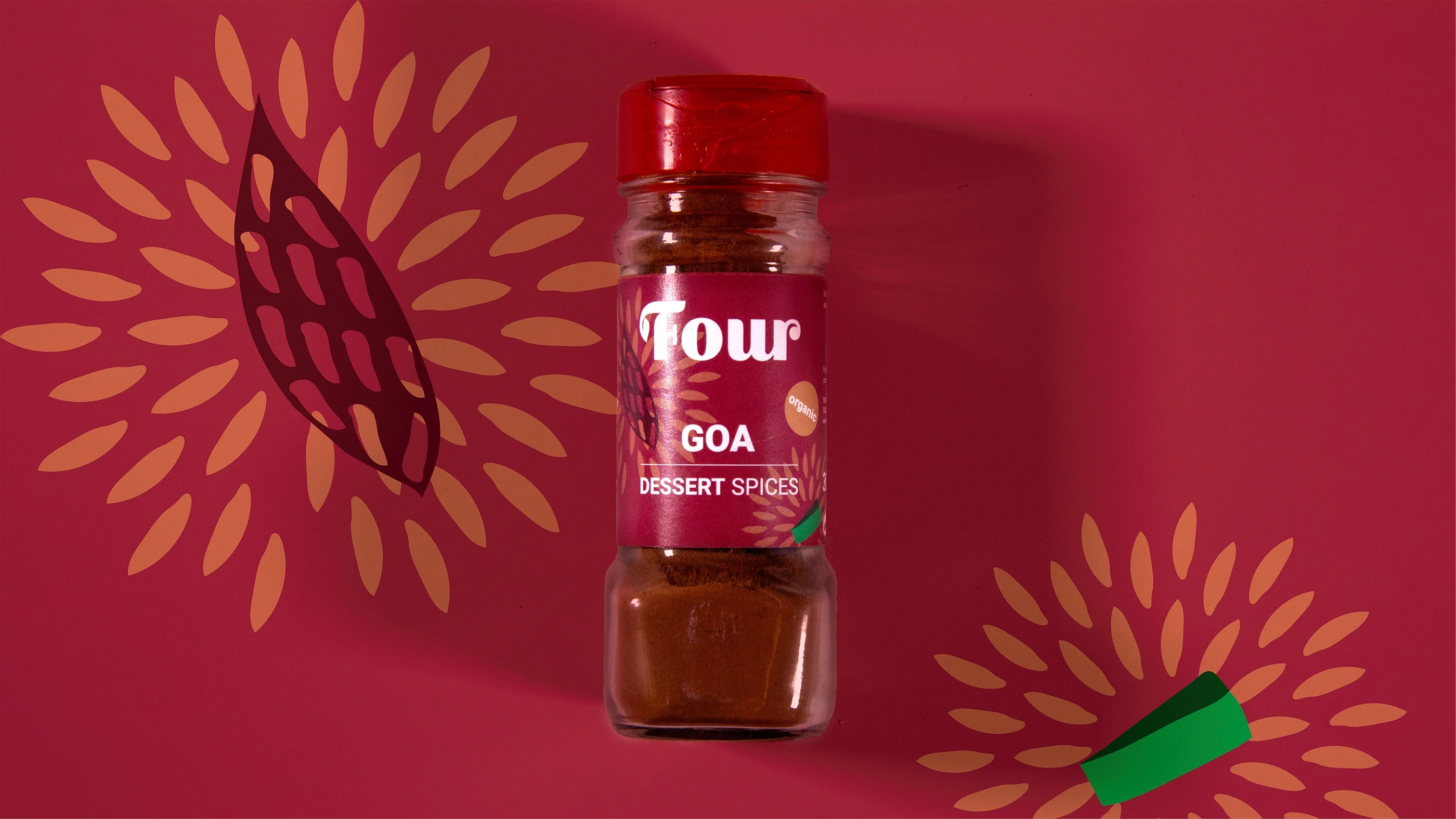
The visual identity and the graphic conception of the packaging was based on the following keywords: natural, seasons, diversity, movement.The graphic approach of this brand had to be contemporary, modern, with a differentiating design and had to contain a message that would either make you smile or think.

Logo The Four logo was designed to reflect the brand’s playful and natural personality while maintaining a bold contemporary presence on packaging. The custom wordmark combines soft organic curves with strong geometric shapes, creating a balance between friendliness and confidence. The exaggerated rounded serifs and flowing letterforms were inspired by the natural shapes of dried fruits, seeds, and sliced ingredients, giving the logo a handcrafted yet modern appearance.

Identity The visual identity for Four was built around the ideas of nature, movement, diversity, and emotional interaction. The system combines vibrant colors, abstract organic illustrations, and playful compositions inspired by the textures and forms of fruits, seeds, and natural ingredients. Each packaging design uses oversized graphic elements and dynamic patterns to create a sense of rhythm and movement, making the products feel alive, energetic, and approachable. The bold contrast between deep saturated backgrounds and bright accent colors helps the products achieve strong shelf visibility while reinforcing the healthy and modern positioning of the brand.